Rationalization Analysis
The Rationalization Analysis page allows you to quickly identify opportunities for rationalization and optimization within your portfolio of architecture assets.
For example, using this chart, you can conduct an Application Portfolio Optimization (APO) exercise and decide actions that will narrow the footprint of your portfolio from a complexity or cost perspective.
To access the rationalization analyzer, open any of your projects and navigate "Analyze Data / Rationalization Analysis."
Choosing the Input Parameters
Before looking at the rationalization opportunities within your project, you will need to specify two input parameters for the report:
- Object type - the kind of objects that you are trying to rationalize or optimize. For example, if you are trying to rationalize your applications, pick "Application" here.
- Association - links to analyze and identify similarities among the objects of the selected type. The concrete association name depends on the project's metamodel. For example, if your project is configured to use the APM metamodel and you intend to rationalize applications by business capabilities, pick "Fulfills Capabilities" from the dropdown.
After selecting the input parameters, hit the "Run" button to display the rationalization opportunities.
Reviewing Rationalization Opportunities
Rationalization opportunities represent clusters of objects with similarities and differences. Similarities make them appear in the same cluster; differences may make eliminating a member from the cluster harder (or unreasonable). For these two competing reasons, the rationalization opportunities table makes it easy to access all this information at a glance and dig deeper where necessary.
For example, let's look at the rationalization opportunities of two clusters and understand how to read them.
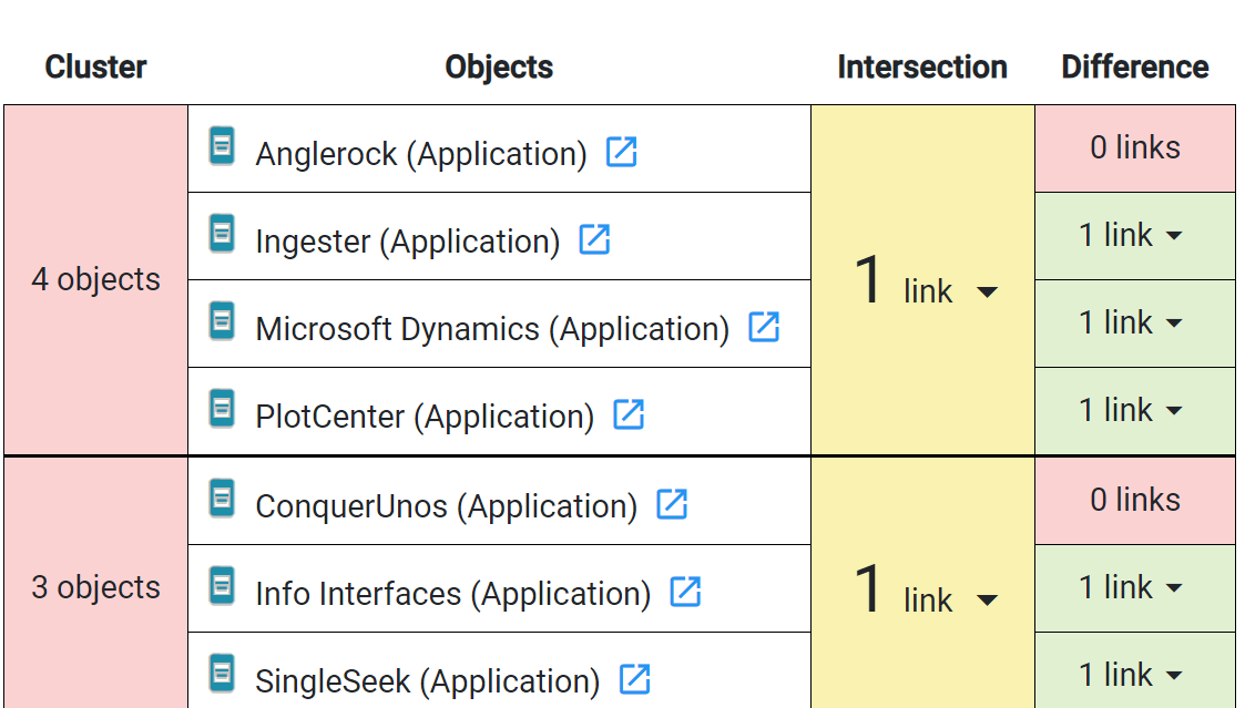
In this table, the first cluster consists of four objects and all of them are listed in the second column. This means the four applications have similar business capabilities. Indeed, in the third column, we see that all these objects have one business capability in common (indicated by the "1 link" text). We will see the capability in common if we click on this cell.
Rationalization implies that we might want to eliminate members that duplicate business capabilities. In this example cluster, which application is the simplest to eliminate? Obviously, the one with no other capabilities that it performs (i.e., a pure overhead)! And we see one such application - the first one (Anglerock) since the difference states "0 links". This attribute tells us that Anglerock only fulfills the capability that it has in common with three other applications - definitely a questionable value-add. All other objects have more differences, making it harder to eliminate those specific applications from the portfolio.
Based on this example, try to interpret the meaning of the second cluster, and you will quickly conclude that the ConquerUnos application can be an easy elimination candidate.
It is possible to click on a cell of intersection or difference to view the objects that make up the displayed number. Additionally, you can view any object in the cluster by clicking the "Edit" button next to the object's name.
Color Codings
The rationalization opportunities table employs a unique color coding to make it easy to read the data and notice low-hanging fruits immediately. For this purpose, cells can have a red, yellow, or green color. Here is what these colors mean for specific columns:
- Cluster column - red indicates the top 33 percentile, followed by yellow and green. If you focus on red colors, those clusters represent the top 33% of cluster sizes (i.e., the number of objects in a cluster). For convenience, the list of clusters also follows the same sorting, showing the most significant clusters first.
- Intersection column - red represents the top 33 percentile by size, followed by yellow and green. Focus on red if you want to find a widespread characteristic among your objects.
- Difference column - green is the top 33% by size within a cluster, followed by yellow and red. Find red colors within each cluster if you are looking for objects that add minimal or no value on top of the intersection (common capabilities). If the difference is "0 links", you are looking at a pure duplication, and nothing added on top of it.
See Also